We often make the mistake of assuming that because a symbol is universally recognized, it is inherently aesthetic. We take the letter A or a Treble Clef, strip them of their context, and place them in a visual composition as if they were independent objects of beauty.
But the moment a functional sign is used merely as a visual element, it slides inevitably into the realm of kitsch.

The only reason this image exists is to serve as an illustration in this article.
The Trap of Context
A symbol like the letter A possesses a singular, rigid purpose: to represent a sound within a stream of language. Its entire existence is defined by this function. When you extract it from a sentence and place it in an image as an “object” or an ornament, you strip it of the only thing that gives it life—its utility.
An object shaped like an A is not a sculptural masterpiece; it is a hollow reference to a function it is no longer performing. It becomes a visual tautology, an ornament that signifies nothing but its own lost purpose.
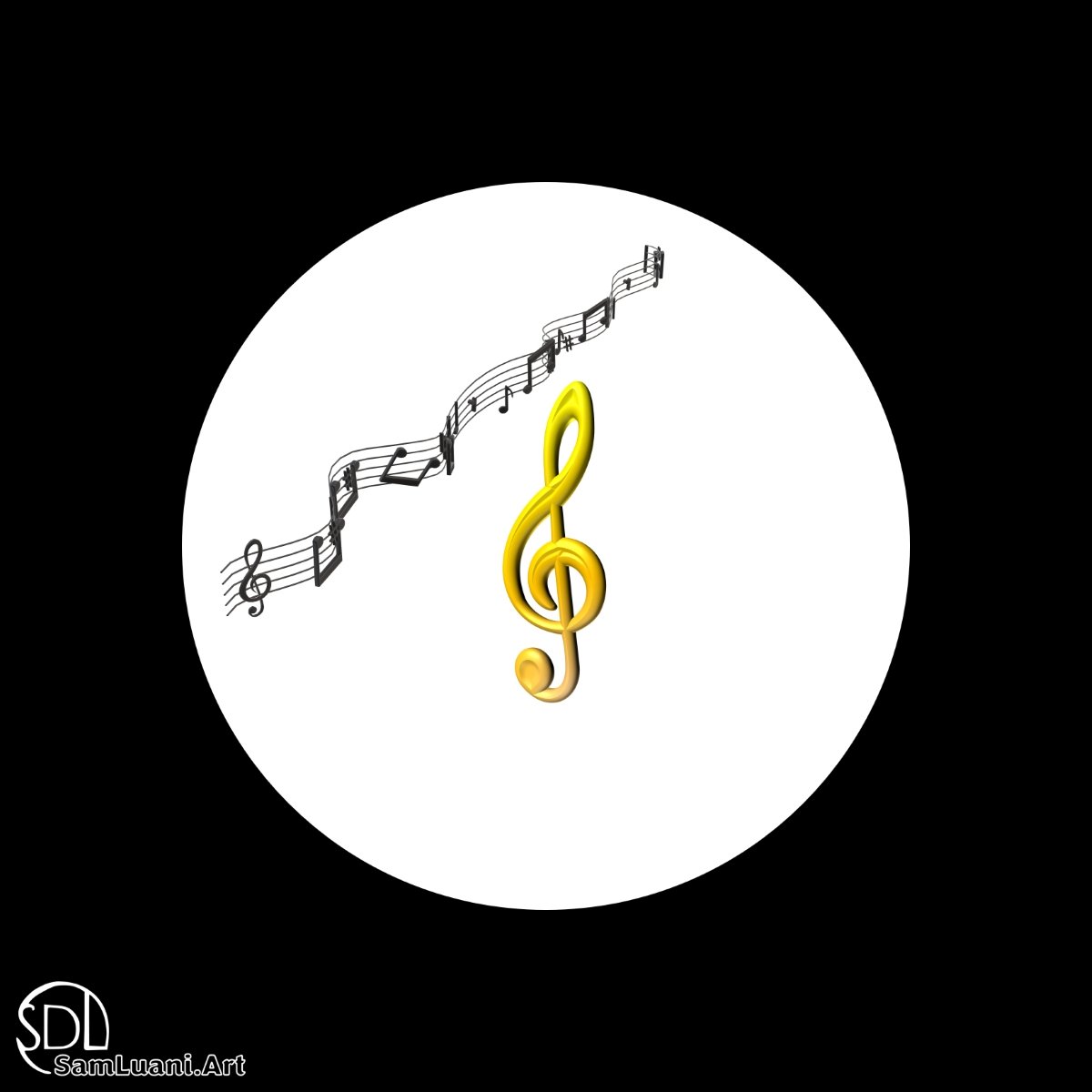
The Treble Clef Syndrome
Consider the treble clef. In its native environment—the musical staff—it is a masterful tool of instruction, telling a musician exactly how to interpret pitch. But when used as a lone decorative element on a wall or a greeting card, it becomes awkward. It is reduced to a lazy shorthand for the idea of music, without possessing any musicality itself.
The more ubiquitous a symbol is, the less interesting it becomes as art. Its familiarity breeds a kind of visual boredom. Because our brains are wired to read these signs instantly, we cannot “see” them as shapes; we only process them as data.
Evolution vs. Invention
The reason these shapes feel so awkward when isolated is rooted in their history. Symbols are not spontaneous artistic inventions; they are the result of centuries of typographic Darwinism.
Letters and musical notations have undergone relentless streamlining. Over hundreds of years, every unnecessary flourish has been sanded away to achieve maximum clarity for the eye specifically within the context of reading. They are hyper-optimized tools. Because they are so perfectly streamlined for duty, they lack the ambiguity or complexity required to stand alone as art. They are designed to be looked through (to get to the meaning), not looked at. When you detach them from their native context, you reveal their nakedness. They seem stiff and uncomfortable, like a wrench hanging in a gallery of fine sculpture.